OctoStudio
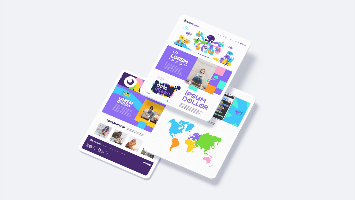
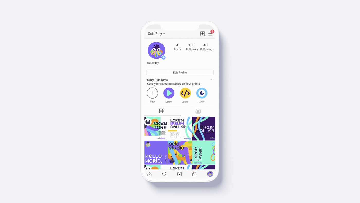
The first version of the visual identity created for the OctoStudio app, developed in collaboration with MIT and the Brazilian Creative Learning Network - RBAC.
Team:
MIT: Mitchel Resnick, Natalie Rusk, Paula Bonta, Carl Bowman
RBAC: João Adriano Freitas
Branding Strategy: Alexandre Mori
Branding Designer: Denis Freitas
Assistant Designer: Bruno Meira
MIT: Mitchel Resnick, Natalie Rusk, Paula Bonta, Carl Bowman
RBAC: João Adriano Freitas
Branding Strategy: Alexandre Mori
Branding Designer: Denis Freitas
Assistant Designer: Bruno Meira
—Intro
At OctoStudio, we believe that art and programming are powerful tools for learning and creativity. We recognize that these disciplines can seem at odds, but we see them as complementary in many ways. By combining art and technology, we can create a unique synergy that informs our visual identity.
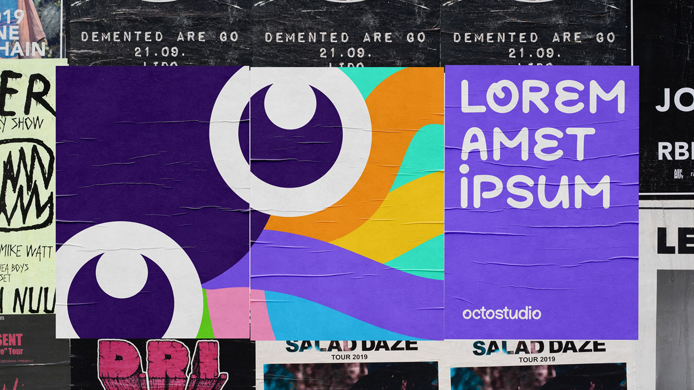
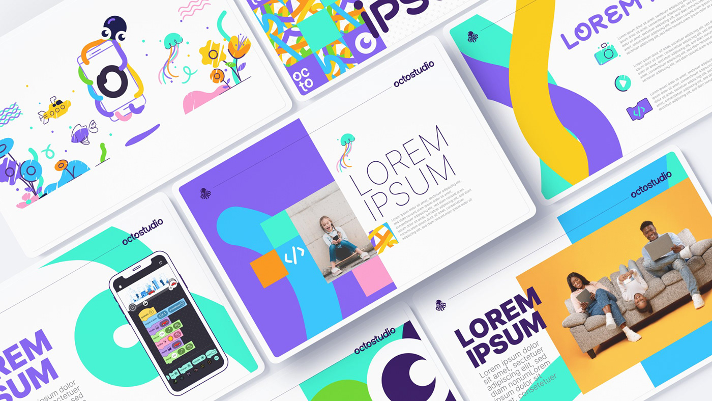
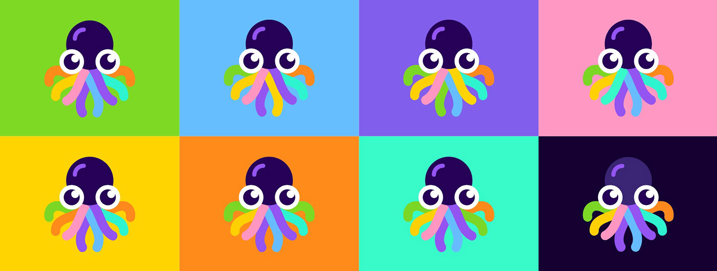
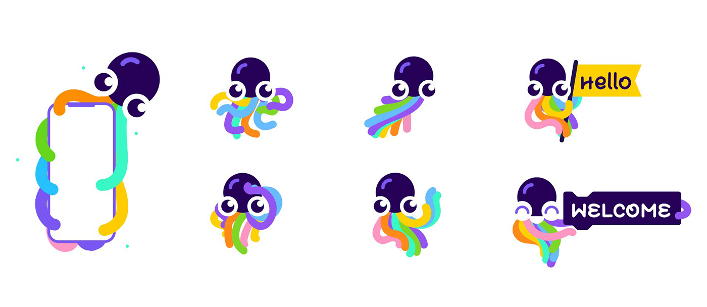
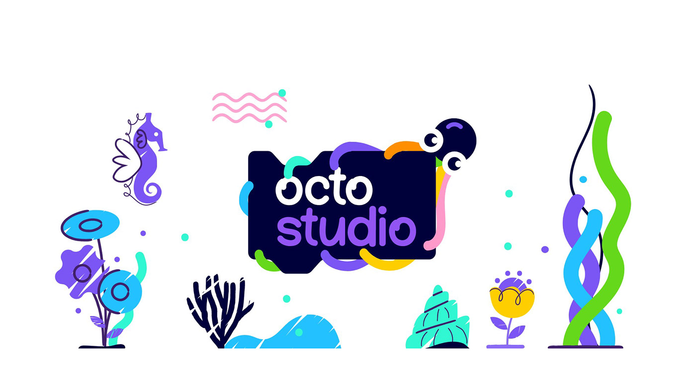
We chose the octopus as our symbol because it represents the boundless possibilities of the creative process. Its tentacles unfold into colorful lines that cross and fill our visual layouts. This concept of the "moving point" is a fundamental element of visual art and design, as Kandinsky famously observed.
Our use of multiple colors reflects our commitment to diversity and inclusion. We believe that creativity should be accessible to everyone, and we encourage our users to explore their full creative potential, both inside and outside the lines.
At OctoStudio, we strive to inspire and empower people to unleash their creativity and transform their world in new and exciting ways.
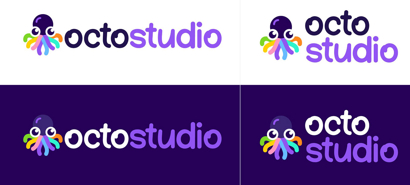
—Logotype
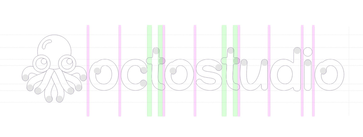
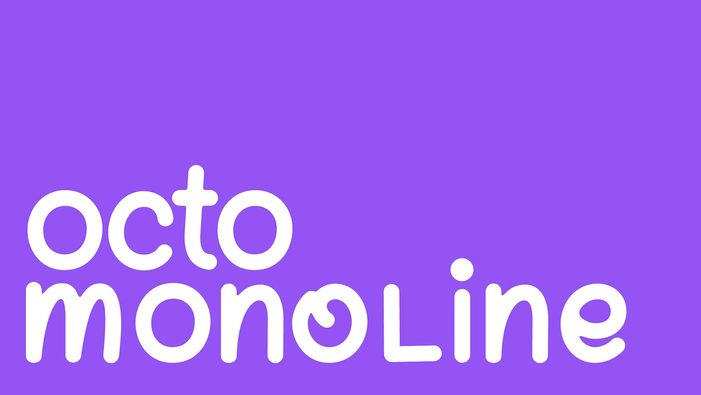
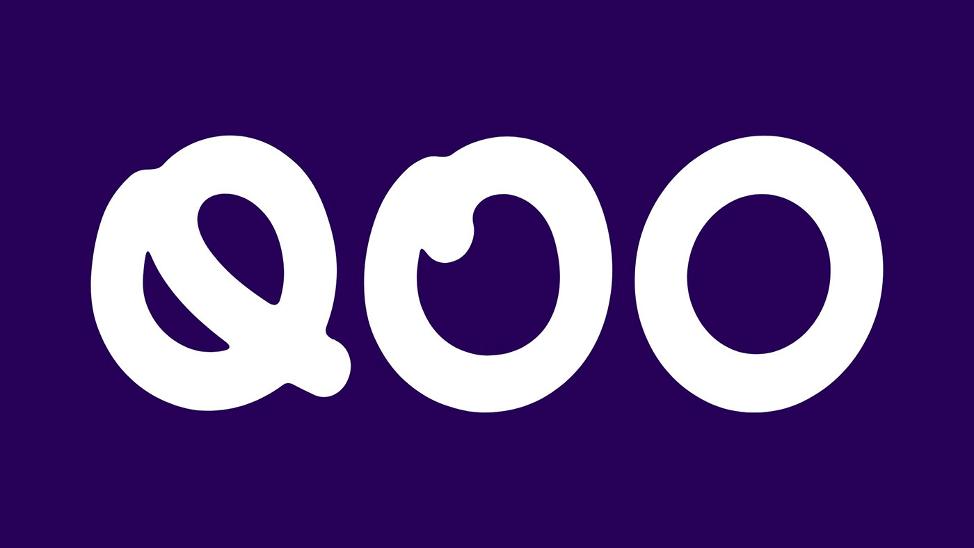
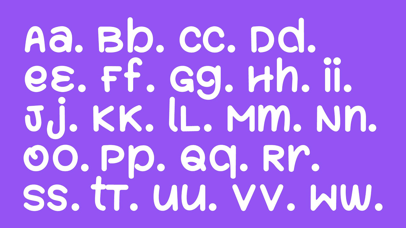
—Custom Font
—Illustrations




—Applications
